
简述
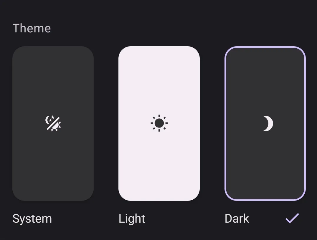
Web中明暗色主题支持已经非常流行了,实现这个功能的手段也非常多,可以用js替换样式,切换css文件,媒体查询…不过我更偏向于配合tailwindcss的class模式去实现,一来使用tailwindcss编写css样式十分高效,对程序猿心智友好,我写的也十分顺手。明暗参数使用Pinia缓存+localStorage持久。
步骤
首先那必然是安装TailwindCss和Pinia 此处不演示 敬请参考官方文档
配置Tailwindcss的
DarkMode为class模式:src/tailwind.config.js/ts/** @type {import('tailwindcss').Config} */ export default { darkMode: 'class', content: [ "./index.html", "./src/**/*.{vue,js,ts,jsx,tsx}", ], theme: { extend: {}, }, plugins: [], }接下来便是配置Pinia部分以使用全局状态控制明暗色切换 按照Vite官方给定的我习惯在stores中编写Pinia代码
代码部分其实你如果懂js基本语法以及Pinia的基本结构的话,看懂这个js在干什么问题应该不大。
状态:
boolean型变量isDark方法:
initTheme:初始化函数,建议在App.vue或者自定义的应用入口引入并调用,用于查询lcoalStorage中存储的主题信息,一般是用户上次访问后留下的值,如果有便读取并将当前状态与其同步。再调用applyTheme以应用样式。applyTheme:`通过js DOM操作修改元素root的样式成员。并访问和修改localStorage中存储的主题信息。toggleTheme:因为存储主题信息的状态为布尔型,所以该函数用于反转状态并应用主题,在开发过程中我们通过它来切换主题。currentTheme:该函数通过判断isDark的值返回字符串light或dark,一般在开发过程中我们通过调用它来知道当前主题,在局部Vue中实现一些特殊的需求或功能。src/stores/theme.jsimport {defineStore} from 'pinia' const useThemeStore = defineStore('theme', { state: () => ({ isDark: false, }), actions: { initTheme() { // 检查本地存储中是否有保存的主题 const savedTheme = localStorage.getItem('theme') if (savedTheme) { this.isDark = savedTheme === 'dark' } else { // 如果没有保存的主题,检查系统偏好 this.isDark = window.matchMedia('(prefers-color-scheme: dark)').matches } this.applyTheme() }, toggleTheme() { this.isDark = !this.isDark this.applyTheme() }, applyTheme() { const root = document.documentElement if (this.isDark) { root.classList.add('dark') } else { root.classList.remove('dark') } // 添加过渡类 root.classList.add('theme-transition') // 保存主题到本地存储 localStorage.setItem('theme', this.isDark ? 'dark' : 'light') // 可选:在过渡完成后移除过渡类 setTimeout(() => { root.classList.remove('theme-transition') }, 300) // 与 CSS 中的 duration 保持一致 } }, getters: { currentTheme: (state) => state.isDark ? 'dark' : 'light' } }) export {useThemeStore}接下来在应用入口处添加主题状态的初始化:
src/views/App.vue<script setup> import {useThemeStore} from "@/stores/theme.js"; const themeStore = useThemeStore() themeStore.initTheme() </script>接下来编写css样式即可,我建议在独立的css文件中将样式模块化,可以经常复用,如下:
src/assets/css/main.css@tailwind base; @tailwind components; @tailwind utilities; .basicBkgColorSwitch{ @apply bg-[rgb(249,249,249,0.5)] dark:bg-[rgb(28,28,28,0.3)]; }经常写css样式的同学肯定很熟悉,在亮色,也就是默认主题下背景为几乎纯白且不透明度为50%;在暗色模式下背景为几乎为纯黑且不透明度为30%。在需要用到该样式的地方我们直接使用class即可,当然不要忘记在
main.js引入你的css文件。现在我们来做一个按钮,用户切换明暗色主题。
src/components/ThemeSwitch.vue<script setup> import {useThemeStore} from "@/stores/theme.js"; const themeStore = useThemeStore() const toggleThemeHandler = () => { themeStore.toggleTheme() } </script> <template> <button class="bg-blue-800 dark:bg-blue-300 rounded-xl p-2" @click="toggleThemeHandler()"> <svg v-if="themeStore.currentTheme === 'light'" xmlns="http://www.w3.org/2000/svg" fill="#FFFFFF" viewBox="0 0 24 24" stroke-width="1.5" stroke="currentColor" class="size-4 text-white"> <path stroke-linecap="round" stroke-linejoin="round" d="M21.752 15.002A9.72 9.72 0 0 1 18 15.75c-5.385 0-9.75-4.365-9.75-9.75 0-1.33.266-2.597.748-3.752A9.753 9.753 0 0 0 3 11.25C3 16.635 7.365 21 12.75 21a9.753 9.753 0 0 0 9.002-5.998Z"/> </svg> <svg v-else xmlns="http://www.w3.org/2000/svg" viewBox="0 0 24 24" fill="currentColor" class="size-4"> <path d="M12 2.25a.75.75 0 0 1 .75.75v2.25a.75.75 0 0 1-1.5 0V3a.75.75 0 0 1 .75-.75ZM7.5 12a4.5 4.5 0 1 1 9 0 4.5 4.5 0 0 1-9 0ZM18.894 6.166a.75.75 0 0 0-1.06-1.06l-1.591 1.59a.75.75 0 1 0 1.06 1.061l1.591-1.59ZM21.75 12a.75.75 0 0 1-.75.75h-2.25a.75.75 0 0 1 0-1.5H21a.75.75 0 0 1 .75.75ZM17.834 18.894a.75.75 0 0 0 1.06-1.06l-1.59-1.591a.75.75 0 1 0-1.061 1.06l1.59 1.591ZM12 18a.75.75 0 0 1 .75.75V21a.75.75 0 0 1-1.5 0v-2.25A.75.75 0 0 1 12 18ZM7.758 17.303a.75.75 0 0 0-1.061-1.06l-1.591 1.59a.75.75 0 0 0 1.06 1.061l1.591-1.59ZM6 12a.75.75 0 0 1-.75.75H3a.75.75 0 0 1 0-1.5h2.25A.75.75 0 0 1 6 12ZM6.697 7.757a.75.75 0 0 0 1.06-1.06l-1.59-1.591a.75.75 0 0 0-1.061 1.06l1.59 1.591Z" /> </svg> </button> </template>现在虽然实现了切换,但是亮色和暗色之间并没有过度效果,马上切换色调的反差极大,用户的体验不是很好,所以我们可以为其添加一个css过渡效果。
src/assets/css/main.css.theme-transition, .theme-transition * { transition: background-color 0.5s, color 0.5s !important; }我们在
theme.js已经做了关于theme-transition的处理,所以我们直接添加该样式便会生效。